Dashboards Reporting

25-26 Jan, 2021, Webinar Classroom Training

IPA Training is Registered with

Learn from the Best

Kelvin Ng
Microsoft Office 2016 Master Specialist
Microsoft Certified Trainer


Kelvin Ng Choo Kent is a highly experienced digital arts instructor and master trainer with more than 17 years of experience in the office automation consultation, graphic design, animation and print production arena. He is a graduate of Malaysian Institute of Art (MIA) And holds the distinction of being certified as Adobe Certified Expert (ACE), Microsoft Office 2016 Master Specialist MCP & MCT, Certified practitioner of Neuro-Semantics, Certified practitioner of Neuro-Linguistic programming & Certified practitioner of Hypnosis & Time-Lines.


Microsoft Certification

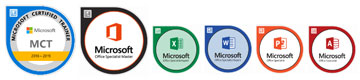
  • MICROSOFT CERTIFIED TRAINER (MCT) SINCE 2012
  • MICROSOFT OFFICE 2016 MASTER SPECIALIST (MOS)
  • MICROSOFT OFFICE EXCEL 2016 SPECIALIST (MOS)
  • MICROSOFT OFFICE WORD 2016 SPECIALIST (MOS)
  • MICROSOFT OFFICE POWERPOINT 2016 SPECIALIST (MOS)
  • MICROSOFT OFFICE ACCESS 2016 SPECIALIST (MOS)

Professional Qualifications

  • PSMB APPROVED TRAINER
  • CERTIFIED ETHICAL HACKER (CEH)
  • ADOBE CERTIFIED EXPERT (ACE)
  • CERTIFIED PRACTITIONER OF NEURO-SEMANTICS
  • CERTIFIED PRACTITIONER OF NEURO-LINGUISTIC PROGRAMMING
  • CERTIFIED PRACTITIONER OF HYPNOSIS & TIME- LINES


AREA OF EXPERTISE
Office Tools
Microsoft Office Suite (2003, 2007, 2010, 2013, 2016), Adobe Acrobat, Microsoft Visio


Soft Skill
Effective Presentation, Train The Trainer, Microsoft Office Business Application Coaching, Effective Communication


Graphic Design

Adobe Photoshop, Adobe Illustrator, Adobe Indesign, Quarkxpress, Adobe Pagemaker, Corel Draw, Corel Photo Paint

His Clientele


Venue Details

Webinar Classroom Training

Contact us

Juliany,
03 2283 6109
juliany@ipa.com.my

Phoebe,
03 2283 6100
phoebe@ipa.com.my 

FOR CUSTOMISED IN-HOUSE TRAINING
Jane,
03 2283 6101
Jane@ipa.com.my

ADDRESS 
A-28-5, 28th Floor, Menara UOA Bangsar, 
No.5, Jalan Bangsar Utama 1, 
59000 Kuala Lumpur
www.ipa.com.my

FOCUSING ON
  • Module 1: Introducing Dashboards
  • Module 2: Table Design Best Practices
  • Module 3: Visualization Techniques
  • Module 4: Introducing Charts (I)
  • Module 5: Introducing Charts (II)
  • Module 6: Formatting And Customizing Charts
  • Module 7: Developing Data Model
  • Module 8: Adding Interactive Controls
  • Module 9: Excel Macro
  • Module 10: Using Pivot Tables
AFTER ATTENDING THIS COURSE YOU WILL RETURN TO YOUR JOB…
  1. Building interactive reports.
  2. Visualizing data using Chart.
  3. Using techniques to make Interactive controls.
  4. Using Slicer to analyse reports.
  5. Presenting data with PivotTable and Pivot Charts.
WHO SHOULD ATTEND
Personnel who use Microsoft Excel to analyse and prepare management reports, especially Administrative, Operational and Middle Management Staff
METHODOLOGY
  • Guided Learning, group-paced, hands-on classroom training with real life examples for business applications.
  • Challenging exercises are set based on practical applications for typical organizational functions such as HR, Admin, Production, Sales etc.
DAY 1
9:00

MODULE 1: INTRODUCING DASHBOARDS

  • What Are Dashboards & Reports?
    - Defining reports
  • Defining dashboards
    - Establish the User Requirements
    - Define the message(s)
    - Establish the audience
    - Define the performance measures
    - List the required data sources
    - Define the dimensions and filters
    - Determine the need for drill-down details
    - Establish the update schedule
  • A Quick Look at Dashboard Design Principles
    • Rule number 1: Keep it simple
    - Use layout and placement to draw focus
    - Format numbers effectively
    - Use titles and labels effectively
    • Key Questions to Ask Before Distributing Your Dashboard
10.45

MODULE 2: TABLE DESIGN BEST PRACTICES

  • Table Design Principles
    - Use colours sparingly
    - De-emphasize borders
    - Use effective number formatting
    - Subdue your labels and headers
  • Enhancing Reporting with Custom Number Formatting
    - Number formatting basics
    - Formatting numbers in thousands and millions
    - Hiding and suppressing zeros
    - Formatting dates and times
    - Adding conditions to customer number formatting
 

MODULE 3: VISUALIZATION TECHNIQUES

  • Enhancing Reports with Conditional Formatting
    - Applying basic conditional formatting
    - Adding your own formatting rules manually
    - Show only one icon
    - Show Data Bars and icons outside of cells
    - Representing trend with icon sets
    - Using Symbols to Enhance Reporting
  • Using Excel’s Camera Tool
    - Finding the Camera tool
    - Using the Camera tool
    - Enhancing a dashboard with the Camera tool
1.00 Lunch
2:00

MODULE 4: INTRODUCING CHARTS (I)

  • Basic Steps for Creating a Chart
    - Creating the chart
    - Switching the row and column orientation
    - Changing the chart type
    - Applying chart styles
    - Adding and deleting chart elements
    - Moving and deleting chart elements
    - Formatting chart elements
  • Working with Charts
    - Moving and resizing a chart
  • Working with Chart Series
    - Specifying the Data for your Chart
    - Adding a New Series to a Chart
    - Adding a new series by extending the range highlight
    - Adding a new series using the Select Data Source dialog box
  • Modifying the Data Range for a Chart Series
    - Using range highlighting to change series data
    - Using the Select Data Source dialog box to change series data
3.45

MODULE 5: INTRODUCING CHARTS (II)

  • Understanding Series Names
    - SERIES formula syntax
    - Changing a series name
  • Adjusting the Series Plot Order
  • Charting a Noncontiguous Range
  • Using Series on Different Sheets
  • Handling Missing Data
  • Controlling a Data Series by Hiding Data
  • Unlinking a Chart Series from Its Data Range
    - Converting a chart to a picture
    - Converting a range reference to arrays
  • Working with Multiple Axes
    - Creating a secondary value axis
5.00

End of Day 1

DAY 2
9:00

MODULE 6: FORMATTING AND CUSTOMIZING CHARTS

  • Selecting chart elements
  • Adjusting Fills and Borders:
    - About the Fill tab
    - Formatting borders
  • Formatting Chart Background
    - Working with the chart area
    - Working with the plot area
  • Formatting Chart Series
    - Basic series formatting
    - Using pictures and graphics for series formatting
    - Additional series options
  • Working with Chart Titles
    - Adding titles to a chart
    - Changing title text
    - Formatting title text
    - Linking title text to a cell
  • Working with a Chart’s Legend
    - Adding or removing a legend
    - Formatting a legend
    - Changing the legend text
    - Deleting a legend entry
    - Identifying series without using a legend
  • Working with Chart Axes
    - Value axis versus category axis
    - Value axis scales
  • Working with Data Labels
    - Adding or removing data labels
    - Editing data labels
  • Working with a Chart Data Table
  • Adding and removing a data table
10.45

MODULE 7: DEVELOPING DATA MODEL

  • Separating the data, analysis and presentation layers
    - The Data Layer
    - The analysis layer
    - The presentation layer
  • Data Model Best Practices
    - Avoid storing excess data
    - Use tabs to document and organize your data model
    - Test your data model before building presentation components
  • Excel Functions for Your Data Model
    - Understanding lookup tables
    - The VLOOKUP function
    - The SUMPRODUCT function
    - The Choose function
  • Working with Excel Tables
    - Converting a range to an Excel table
    - Converting an Excel table back to a range
 

MODULE 8: ADDING INTERACTIVE CONTROLS

  • Getting Started with Form Controls
    - Finding Form controls
    - Adding a control to a worksheet
  • Using the Button Control
  • Using the Check Box Control
    - Check box example: Toggling a chart series on and off
  • Using the Option Button Control
    - Option button example: Showing many views through one chart
  • Using Combo Box Control
    - Combo box example: Changing chart data with a drop- down selector
  • Using the List Box Control
    - List box example: Controlling multiple charts with one selector
1.00 Lunch
2:00

MODULE 9: EXCEL MACRO

  • Building navigation buttons
  • Dynamically rearranging pivot table data
  • Offering one-touch reporting options
3.45

MODULE 10: USING PIVOT TABLES

  • Introducing the Pivot Table
  • Anatomy of a pivot table
    - Values area
    - Row Labels area
    - Column Labels area
    - Filter area
  • Creating the basic pivot table
    - Laying out the pivot table
    - Modifying the pivot table
    - Changing the pivot table view
    - Updating your pivot table
  • Pivot tables and worksheet bloat
  • Customizing Your Pivot Table
    - Changing the pivot table layout
    - Renaming the fields
    - Formatting numbers
    - Changing summary calculations
    - Suppressing subtotals
    - Removing all subtotals at one time
    - Removing the subtotals for only one field
    - Removing grand totals
    - Hiding and showing data items
    - Hiding and showing items without data
    - Sorting your pivot table
  • Examples of Filtering Your Data
    - Producing top and bottom views
    - Creating views by month, quarter, and year
    - Creating a percent distribution view
    - Creating a YTD totals view
    - Creating a month-over-month variance view
  • Using conditional formatting with pivot tables
    - Customizing conditional formatting
5.00 End of Course