Building Interactive Reports & Dashboard using Microsoft Excel

22-23 Mar, 2021, Webinar Classroom Training

IPA Training is Registered with

Learn from the Best


Kelvin Ng Choo Kent is a highly experienced digital arts instructor and master trainer with more than 17 years ofexperience in the Office Automation Consultation, Graphic Design, Animation and Print Production arena. He is a graduate of Malaysian Institute of Art (MIA) and holds the distinction of being certified as Adobe Certified Expert (ACE), Microsoft Office 2016 Master Specialist MCP & MCT, Certified Practitioner of Neuro-Semantics, Certified Practitioner of Neuro-Linguistic Programming & Certified Practitioner of Hypnosis & Time-Lines.
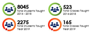
Venue Details

Webinar Classroom Training

Contact us

Juliany,
03 2283 6109
juliany@ipa.com.my

Phoebe,
03 2283 6100
phoebe@ipa.com.my 

FOR CUSTOMISED IN-HOUSE TRAINING
Jane,
03 2283 6101
Jane@ipa.com.my

ADDRESS 
A-28-5, 28th Floor, Menara UOA Bangsar, 
No.5, Jalan Bangsar Utama 1, 
59000 Kuala Lumpur
www.ipa.com.my

FOCUSING ON
  • Introduction to Excel Dashboard & Requirements
  • Explore Data & Formatting in Microsoft Excel
  • Building Interactive Report with Formula (Part 1 & Part 2)
  • Building Advanced Chart (Part 1 & Part 2)
  • Building Interactive Report and Chart (Part 1 & Part 2)
COURSE OVERVIEW
Excel Dashboard is a page that allows managers and business leaders to track key KPIs or indicators and to decide appropriately. It includes diagrams / tables / views supported by facts. Nevertheless, not all reports are dashboards. Dashboard reports provide administrators with a high-level company summary. Excel is an excellent tool for producing powerful dashboards which allow managers to evaluate, inspect and alert on time.
WHO SHOULD ATTEND

Personnel who use Microsoft Excel to analyse and prepare management reports, especially Administrative, Operational and Middle Management Staff.


COURSE REQUIREMENTS

  • Participants should be able to use a PC at the beginner level
  • Basic knowledge and functionality of Microsoft Excel\]
  • Microsoft Office 2013 and above
METHODOLOGY
  • Guided Learning, group-paced, hands-on classroom training with real life examples for business applications.
  • Challenging exercises are set based on practical applications for typical organizational functions such as HR, Admin, Production, Sales etc.
DAY 1
9:00

About DASHBOARD

  • Get to know a PivotTable
  • Introduction to Dashboard
  • Visual interface - at-a-glance
  • Consists of 3 key attributes
  • Excel Dashboards
  • Magazine-Quality Reporting
  • Flexibility
  • Analytical Power
  • Error Handling
  • What Makes A Good Dashboard?
  • Proper Visualizations
  • Themes
  • Tables
  • Charts
  • What do you need?
  • Data
  • Strong Knowledge
  • Final Question
10.45

Understanding Data & Format

  • What is Data Type?
  • How does Data Type affect our formulas or calculations?
  • Number Formatting
  • Excel Date Format
  • Excel Number Custom Format
  • Enhance Reports with Conditional Formatting
1:00 Lunch
2:00

Understanding Data & Format (cont.)

  • Using Excel’s Camera Tool
  • Where Is the CAMERA TOOL?
  • Use Camera Tool as easy as 1,2 3… Smiles
  • About Functions
  • About Excel References
  • Use Name Range as Absolute Reference
  • Indirect Function
  • Offset Function
3:45

About Functions (cont.)

  • VLOOKUP Functions
  • Database Function
  • SUMIFS
  • SUMPRODUCT Function
5:00 End of Day 1
DAY 2
9:00

Presenting Data using CHART

  • Select Data
  • Chart Elements
  • Type of Charts
  • Cluster Column Charts
  • Bar Chart
 

Presenting Data using CHART (cont.)

  • Thermometer Chart
  • Pie Chart
  • Speedometer Chart (Background)
  • Speedometer Chart (Needle)
1:00 Lunch
2:00

Building Dashboard

  • Building Dashboard with Formula & Formatting
  • Visualizing Dashboard using Chart
5:00 End of Course